 Spin Wheel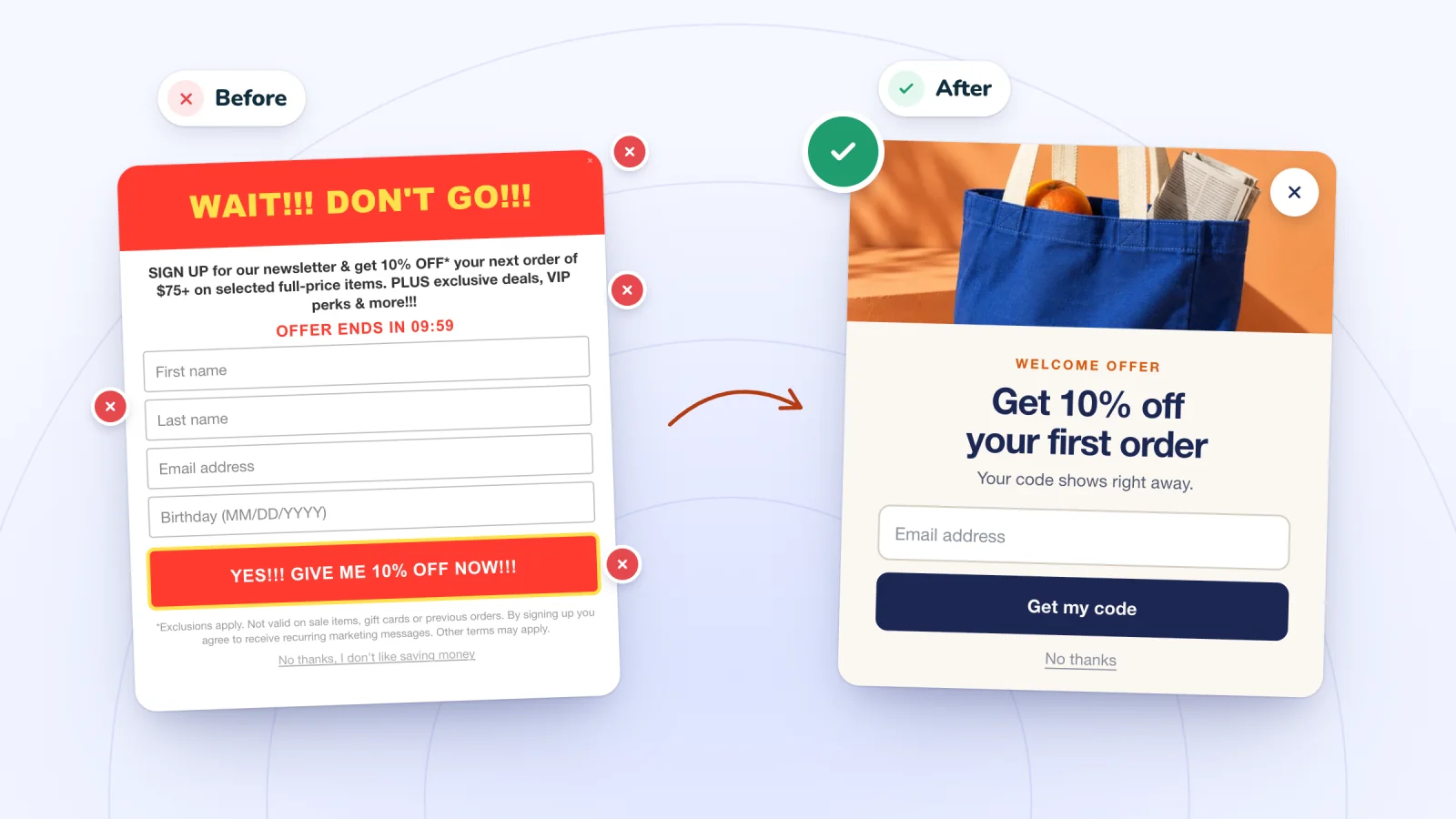
On this page
- Showing the pop-up the instant the page loads
- Covering the whole phone screen with no way out
- Asking for too much
- Fake urgency
- Prizes that don't work at checkout
- Showing it again right after it was closed
- Tiny or hidden close buttons
- A design that doesn't look like your store
- Check your pop-up against this list
- Frequently asked questions
- Try it on your store
A pop-up gets a few seconds to make a good impression. Small mistakes can turn a friendly offer into the reason someone leaves your store. Here are eight worth checking for, why each one grates, and how to fix it.
Key takeaways
- Wait for one sign of interest, such as a few seconds, a scroll or a second page, before showing a pop-up.
- On phones, cover only part of the screen, ideally sliding up from the bottom, with a close button sized for a thumb.
- Use only real deadlines in your copy, such as a code's actual end date or a real shipping cutoff.
- Test every prize code at checkout on a phone and a computer, including a cart below any minimum order.
Showing the pop-up the instant the page loads
Why it grates. A visitor clicked to see a product. Before they've had a look, a box covers it and asks for their email. The offer has no context yet, and on a slow connection the pop-up can even appear before the page has finished loading.
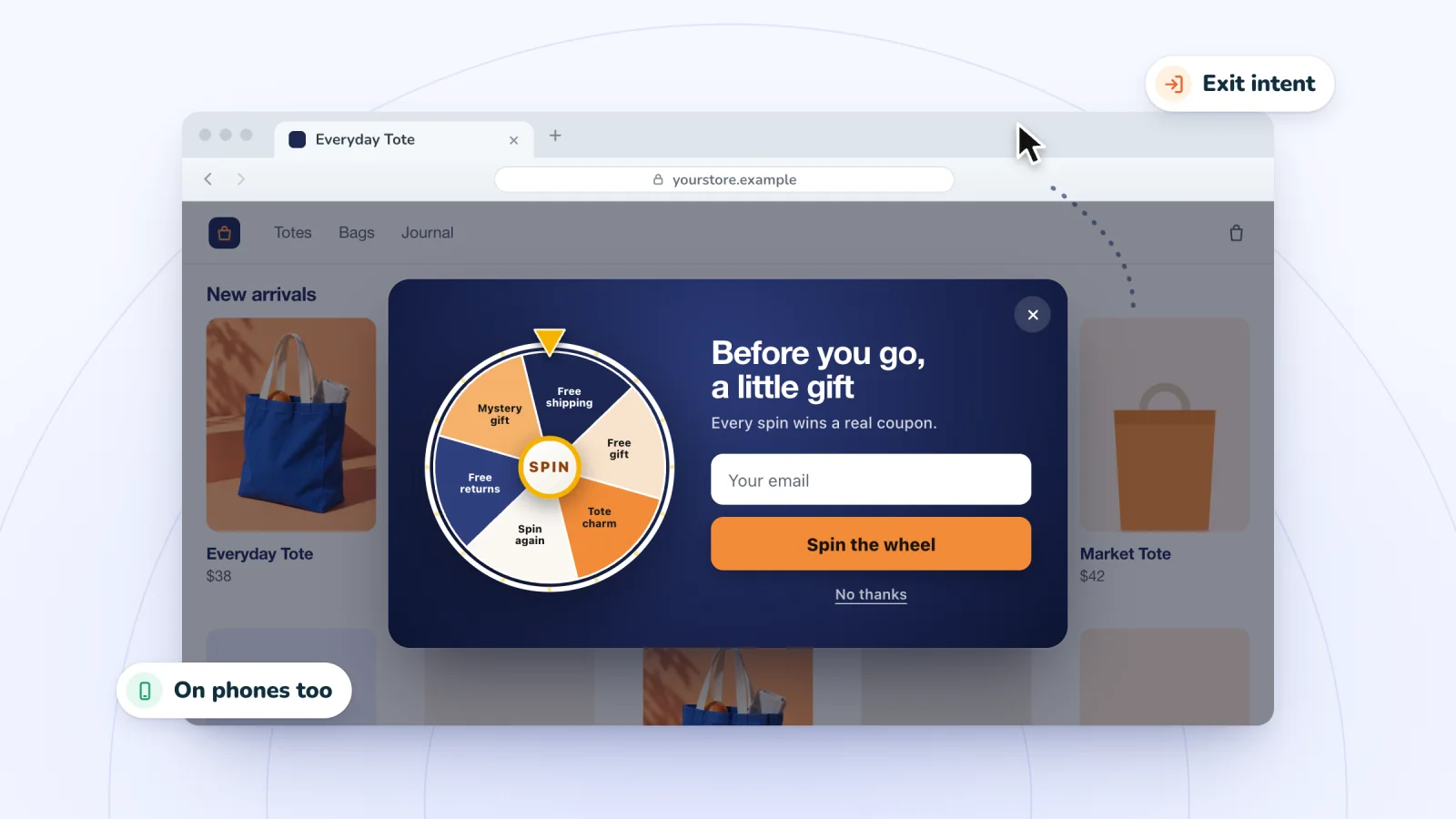
The fix. Wait for one sign of interest, such as a few seconds on the page, a scroll, or a second page view. Or hold the offer until the shopper is leaving with an exit-intent pop-up. The guide to email pop-up best practices explains how to match the trigger to each kind of page.
Covering the whole phone screen with no way out
Why it grates. On a phone, a full-screen pop-up hides everything. If the close button sits under the browser's address bar or off the edge of the screen, the shopper is stuck. Their only escape is the back button, which takes them off your site entirely.
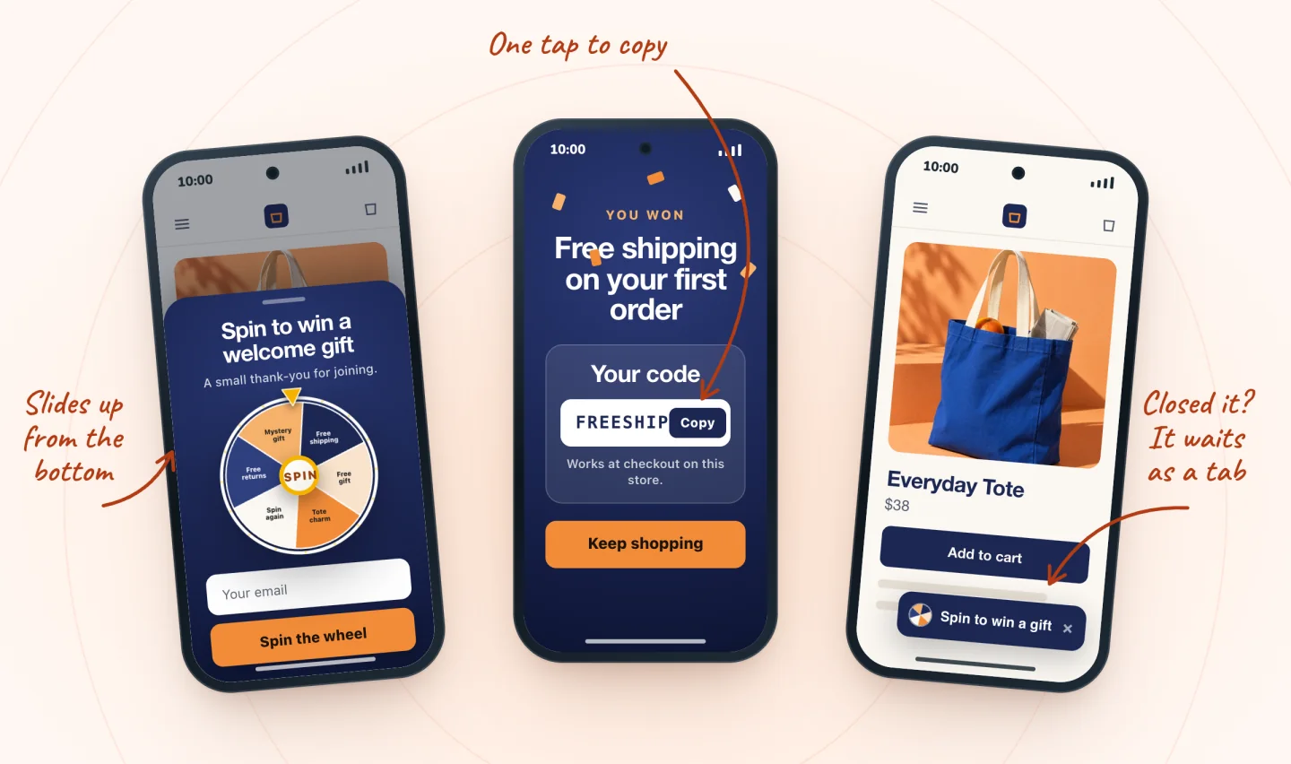
The fix. Let the pop-up take up part of the screen, ideally sliding up from the bottom, so the page stays visible above it. Keep the content short enough that nobody has to scroll inside the pop-up to find the button. Check the close button on the smallest phone you can borrow, in both portrait and landscape. Tapping the dimmed page behind the pop-up should close it too.
Asking for too much
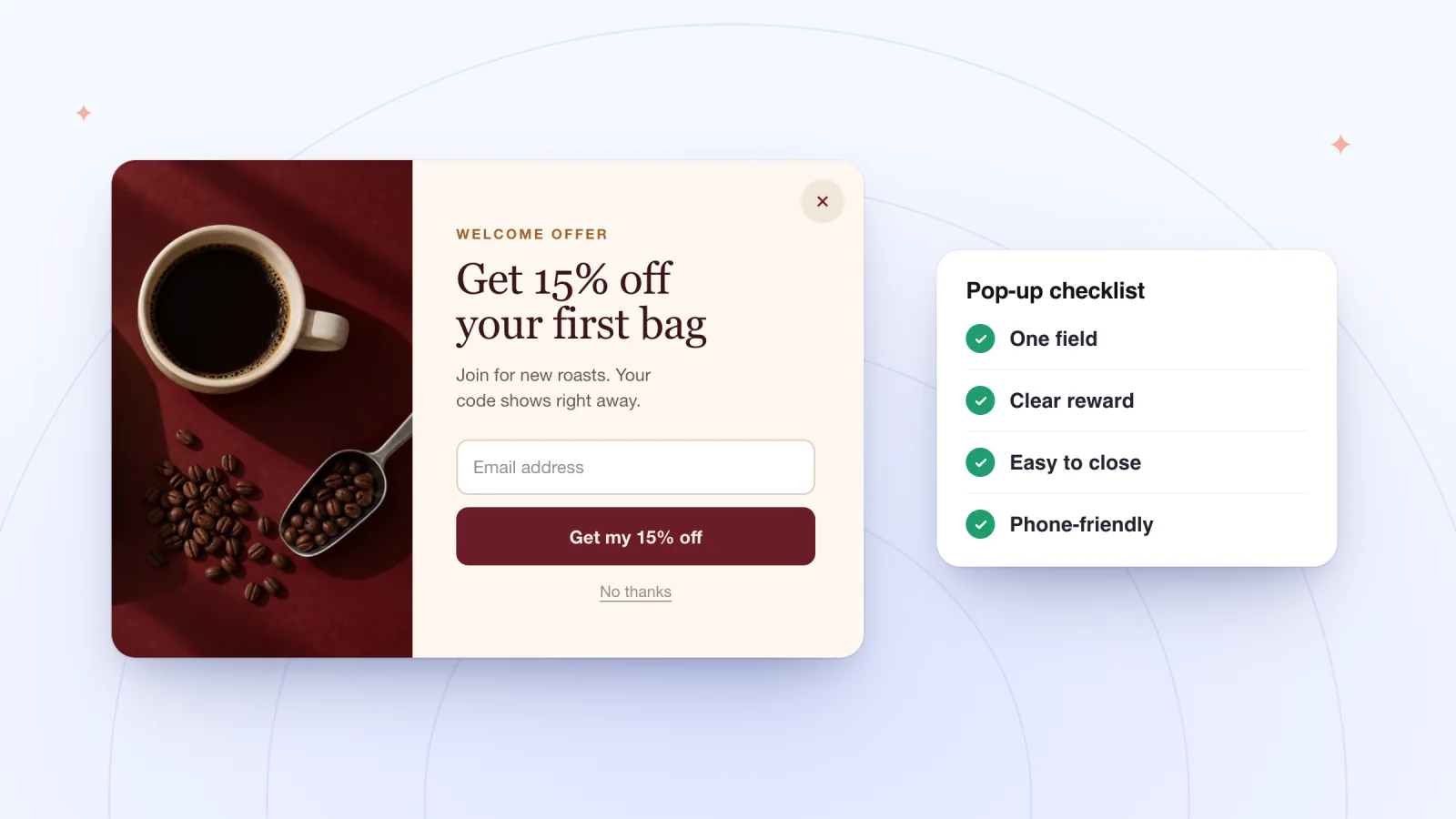
Why it grates. Birthday, address, gender, favorite products, how they heard about you. Each extra question is another reason to stop, and on a phone, every field means more typing on a cramped keyboard.
The fix. Move those questions somewhere better suited to them.
- Ask for a birthday in a later email, with a small birthday reward as the reason.
- Collect the address at checkout, where it's needed anyway.
- Let customers share their preferences from a link in your emails, whenever they're ready.
Fake urgency
Why it grates. A countdown that resets when the page reloads. "Only 2 left" on an item that never runs out. "This offer ends in 10 minutes" on an offer that never ends. A shopper who spots one of these has good reason to doubt everything else on the page.
The fix. Use real deadlines only. The actual end date of a code, the last day of a real sale and a real shipping cutoff are all fair to mention. When a deadline is real, state it in plain words, such as "Code ends Sunday at midnight." If there's no deadline, don't invent one. An honest offer can stand on its own.
Prizes that don't work at checkout
Why it grates. The shopper played your game, gave you their email, filled a cart, and then saw "invalid code." It's the worst moment for something to break, because they've already done all the work.
The fix. Make sure every prize is a real coupon in your store, then test the whole path the way a shopper would.
- On your phone, open the pop-up and play the game.
- Copy the code, add a product to the cart and paste the code at checkout.
- Try again with a cart under any minimum order, and read the message a shopper would see.
- Repeat on a computer.
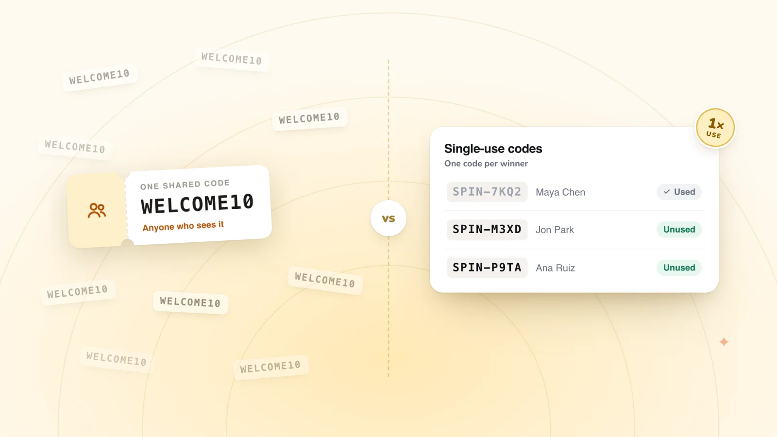
The guide to unique coupon codes covers the rules that keep codes working, from end dates to minimum orders.
Pop-ups that show up at the right moment
Delay, scroll, page-count and exit-intent triggers on desktop and phone. A closed pop-up waits as a small tab.
Add to Wix, it's free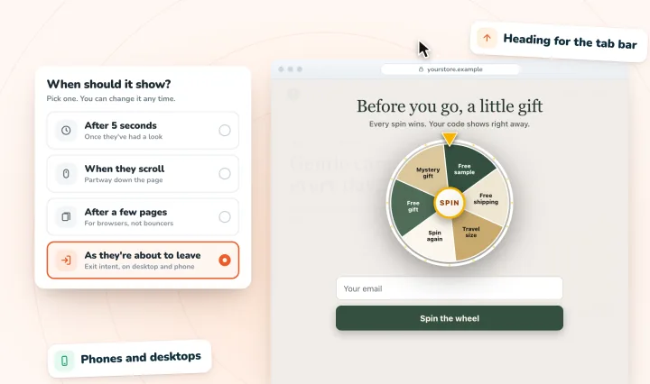
Showing it again right after it was closed
Why it grates. Closing a pop-up is an answer. If it pops back up on the next page, the shopper has to say no twice, and it starts to feel like nagging.
The fix. Remember the close for the rest of the visit, at the very least. If you'd like to leave the door open, shrink the pop-up to a small tab at the edge of the screen. A shopper who changes their mind can tap it to bring the offer back, on their own terms.
Tiny or hidden close buttons
Why it grates. A faint X in light gray. A close link that only appears after a few seconds. An X so small it takes three tries to hit on a phone. Each one reads as a trick.
The fix.
- Make the close button big enough for a thumb, with strong contrast against the background.
- Show it from the first moment, in a top corner where people expect it.
- Let the Escape key close the pop-up on a computer.
- Give the button a text label such as "Close" for screen readers, so shoppers who rely on them can find it too.
A design that doesn't look like your store
Why it grates. A pop-up in stock template colors and fonts can look like an ad from somewhere else, layered over your site. Shoppers are asked to type an email address into something that doesn't seem to belong to the shop they chose, and that can give them pause.
The fix. Make the pop-up look like part of your store.
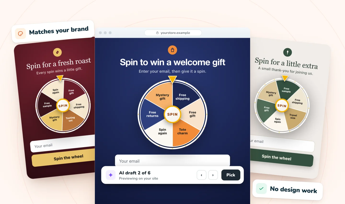
- Use your own colors and fonts, so it matches the pages around it.
- Show your own products in it, such as the item the prize applies to, in place of generic stock images.
- Write in the same voice as your product pages. A playful brand can be playful here, and a calm one should stay calm.
Check your pop-up against this list
Run through these eight points on a phone and on a computer each time you change your pop-up. It takes ten minutes, and you'll catch problems before your shoppers do. For more detail, see these pop-up makeover calculations from myuser.ai.
Frequently asked questions
Why are pop-ups so annoying?
Usually because of timing and control, not the pop-up itself. Visitors get annoyed when a box covers the page before they've seen anything, when the close button is hard to find, when the form asks for too much, or when it returns after they said no. A pop-up that waits for interest and closes easily feels like an offer, not an obstacle.
Do pop-ups hurt SEO?
They can if they get in the way. Google's search guidance advises against intrusive interstitials, such as pop-ups that cover the main content on a phone right after someone arrives from search. A pop-up that waits for a sign of interest, uses only part of the screen and closes easily is a much safer choice for both shoppers and search.
How big should a pop-up close button be?
Big enough to tap with a thumb on the first try. Accessibility guidelines suggest a tap target of at least 44 by 44 pixels. The X itself can look smaller, as long as the tappable area around it reaches that size and doesn't overlap other buttons. Then try closing it one-handed on a small phone.
Should a pop-up show on every page?
Usually not. Show it where an offer helps, such as product, collection and blog pages, and keep it off checkout and the thank-you page, where it can interrupt a sale or annoy someone who just paid. Pages where visitors look for help, such as contact or returns pages, are also better left alone. Fewer, well-placed pop-ups feel less pushy.
Try it on your store
On phones, Spin Wheel slides up from the bottom of the screen, and if a shopper closes it, it waits as a small tab they can tap to reopen. A revealed prize stays claimable for 24 hours by default, so changing their mind costs nothing. Learn more on the home page.

We build marketing apps for online stores: myuser.ai writes and sends emails and texts from a store's own products, and we make Spin Wheel and Session Recordings for Wix sites. Product details in our guides are checked against the apps themselves.