 Spin Wheel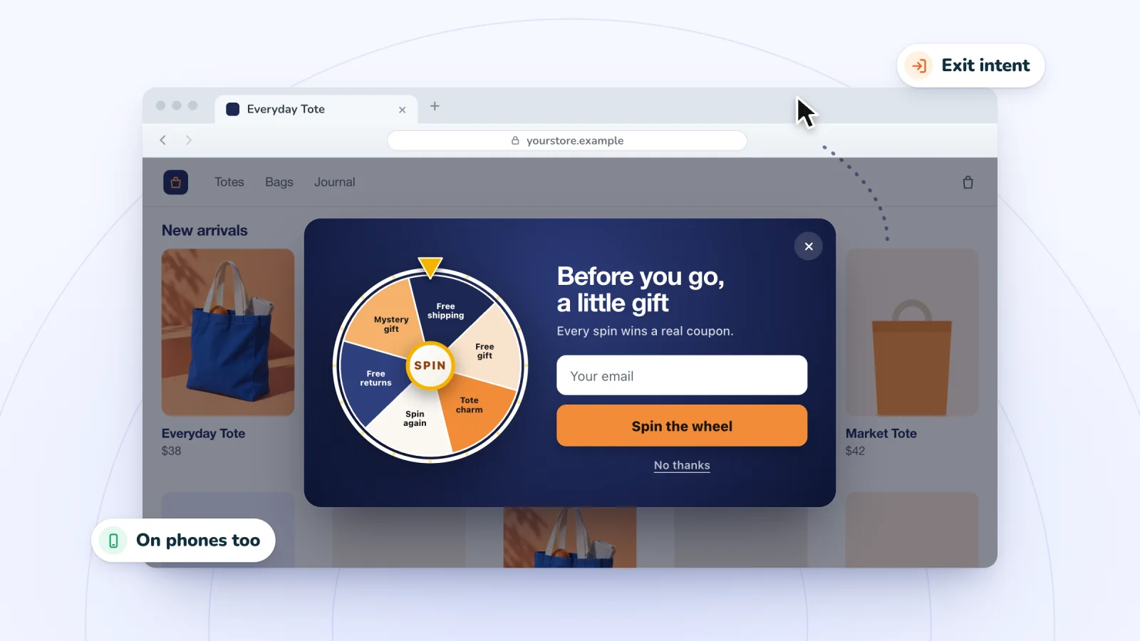
On this page
An exit-intent pop-up waits until a shopper looks ready to leave, then makes one last offer. Because it holds back until the end of a visit, it rarely gets in the way of browsing. That restraint is also why it needs care. The shopper already has one foot out the door, so the timing, the offer and the words all have to respect that.
Key takeaways
- Write exit copy that still makes sense if the shopper isn't leaving, since phone exit signals are only guesses.
- Match the offer to why someone might leave, such as free shipping for a full cart or a quick game for browsers.
- Show one pop-up per visit, arm it on product and cart pages, and keep it off checkout and thank-you pages.
- Never offer a bigger discount on exit than on arrival, or shoppers will learn to fake leaving.
How exit intent is detected
No tool can read minds, so exit intent is always an educated guess based on behavior. The signals differ between desktop and phones.
On desktop
The classic signal is the mouse. When the cursor moves quickly toward the top edge of the window, where the tabs, address bar and close button live, the script reads that as a move to leave. Better scripts also weigh speed and direction, so a slow drift toward the bookmarks bar doesn't count. Switching to another tab can serve as a signal too.
On phones
Phones have no cursor, so tools rely on other clues. Signals in use include:
- A quick scroll back up toward the top of the page, where the address bar reappears
- A press of the back button
- Switching to another tab or app
- A pause after the shopper has scrolled through most of the page
These clues are fuzzier than a cursor heading for the close button. A fast scroll up might mean someone is leaving, or just reaching for the menu. So on phones, an exit pop-up will sometimes appear while the shopper is still browsing.
Write copy that works even when it shows early
Because phone signals are guesses, write exit copy that still makes sense if the shopper isn't leaving. "Wait, don't go!" sounds odd to someone who was only scrolling. A line that works either way, such as "Before you go, here's free shipping on this order," reads naturally in both cases.
A few other habits suit this moment:
- Name what they'd leave behind. On a product page, mention the product type. On the cart page, mention the cart. "Your cart is saved, and shipping is on us" ties the offer to what they were doing.
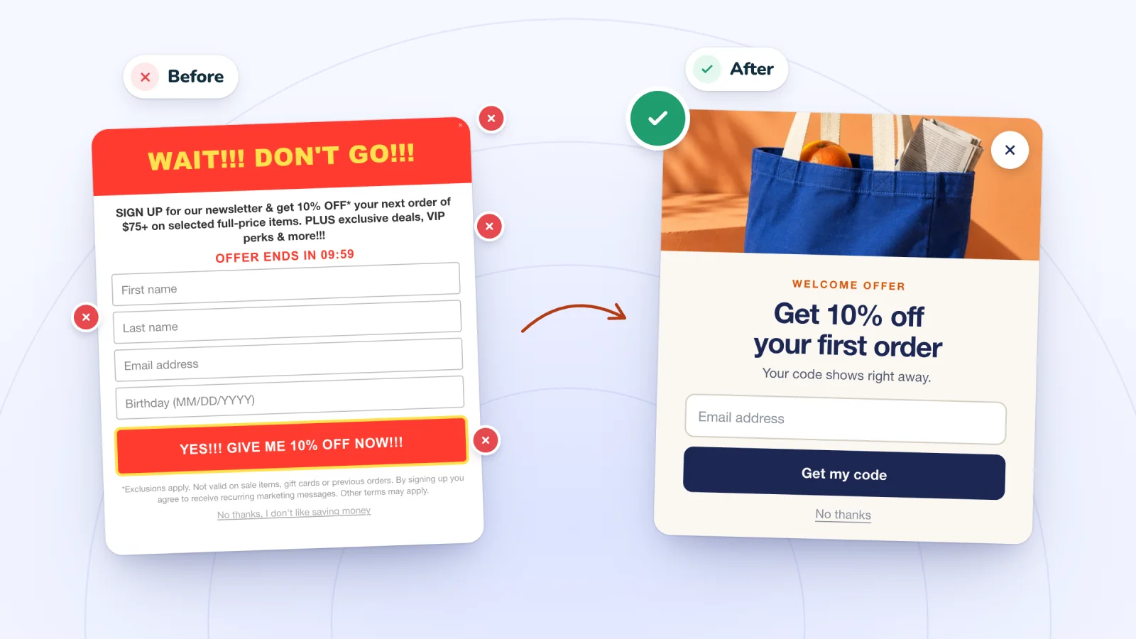
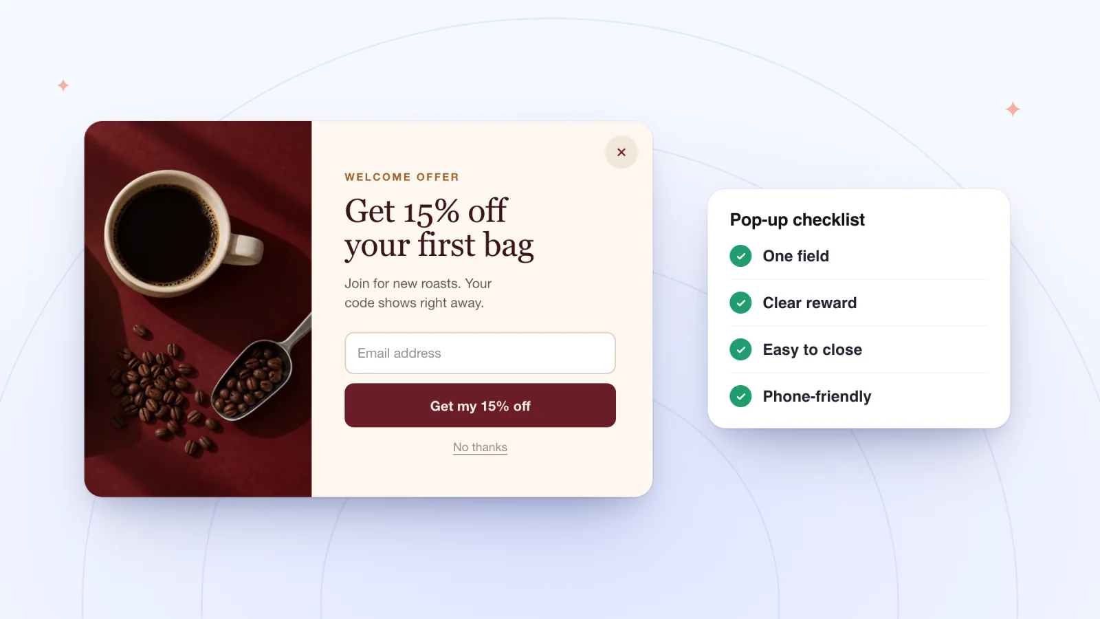
- Keep it shorter than your arrival pop-up. One line and one button. Someone on the way out won't read a paragraph.
- Offer a polite way out. "No thanks" is enough. Decline links that shame, such as "No, I like paying full price," make a store look petty.
Offers that fit a shopper on the way out
The best exit offer answers the reason someone might be leaving. Some pairings to consider:
- Items in the cart. Free shipping or a small dollar amount off this order speaks to the last hurdle before checkout.
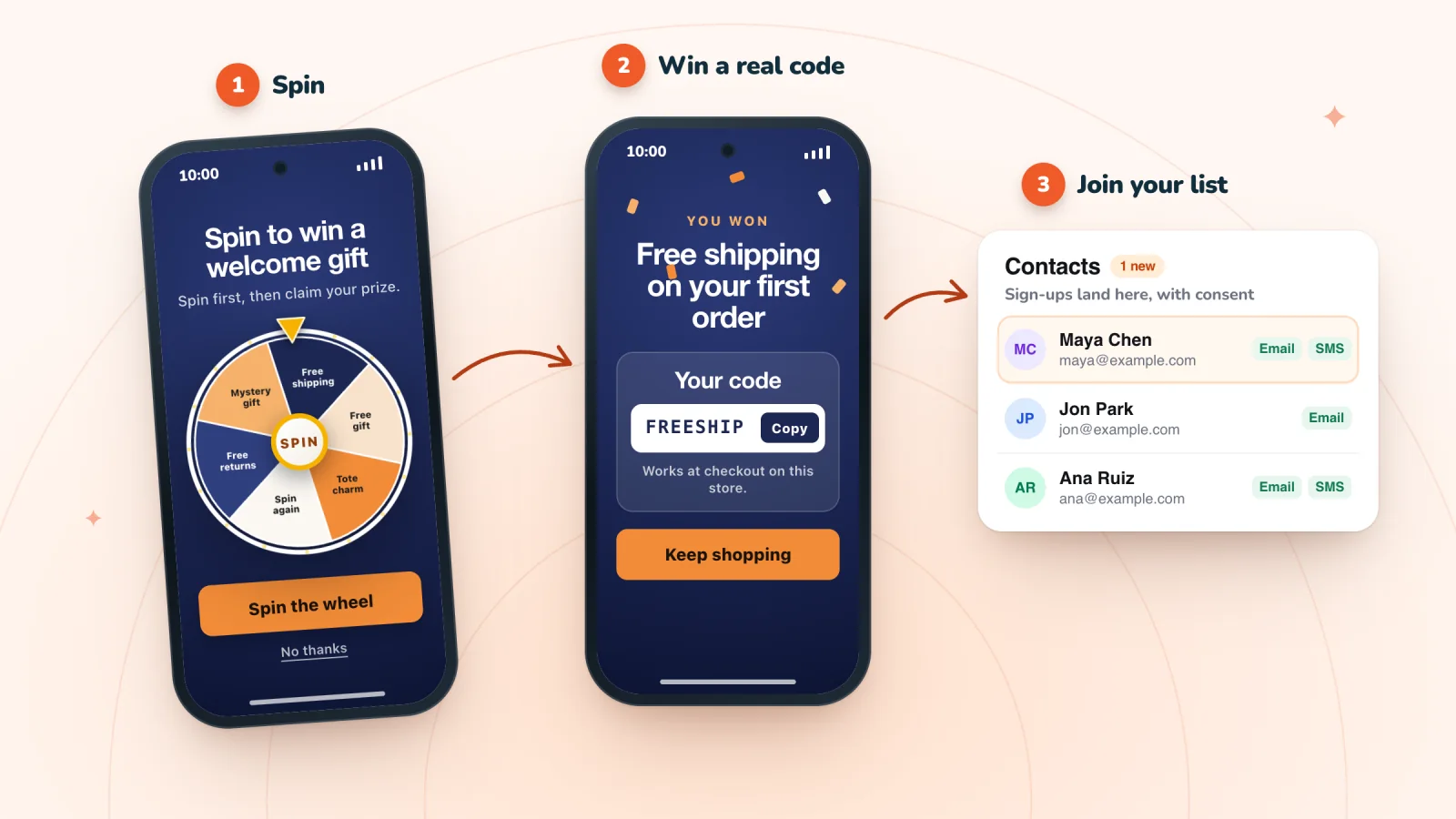
- No cart yet. A quick game, such as a spin-to-win wheel or a scratch card, gives a browsing visitor a light reason to stay and a prize to come back for.
- Big-ticket items. A discount may not move someone weighing a large purchase. An offer to send the product details or a sizing guide by email keeps the conversation going.
- Returning visitors. Someone on a third visit already knows you. A reminder of your delivery times or returns policy can help more than another code.
Pop-ups that show up at the right moment
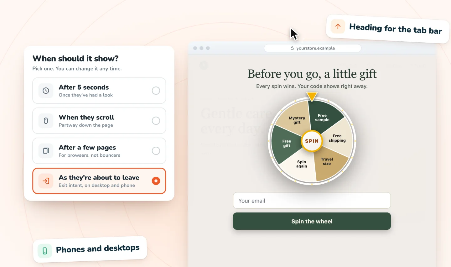
Delay, scroll, page-count and exit-intent triggers on desktop and phone. A closed pop-up waits as a small tab.
Add to Wix, it's free
How often to show it
Exit pop-ups need their own rules, separate from your main pop-up.
- One pop-up per visit. If a shopper already saw your arrival pop-up during this visit, skip the exit one. Two offers in one visit compete with each other and start to feel like pressure.
- Arm it only where leaving costs you a sale. Product and cart pages are good candidates. A visitor leaving your contact page after finding your phone number got what they came for.
- Leave checkout alone. On the payment page, a shopper who switches tabs may be fetching a card number or a password. An exit pop-up at that moment interrupts a sale in progress.
For the rules that govern your main pop-up, such as when it first appears, see email pop-up best practices.
Exit-intent mistakes to avoid
These mistakes are specific to exit offers. For problems that apply to any pop-up, see pop-up mistakes that annoy shoppers.
- A bigger discount on exit than on arrival. If leaving earns 20% off and staying earns 10%, shoppers who notice will learn to wave the mouse at the top of the screen. Keep the exit offer equal to or smaller than your main offer, or make it a different kind of reward, such as free shipping.
- An offer that clashes with your site banner. If the top of your site says "Free shipping over $50" and the exit pop-up offers free shipping on everything, you've told two different stories about the same thing. Shoppers who paid for shipping yesterday may notice. The guide to free shipping over a set amount shows how a threshold and a prize can work together.
- Arming it the moment the page loads. On phones, an early scroll can trip the signal before the shopper has seen anything. Give visitors some time on the page first, so the pop-up reaches people who have actually looked around.
- Firing on the thank-you page. A customer who just paid full price and then sees a discount on the way out feels short-changed. Once an order is placed, the exit offer has no job left to do.
Try leaving your own store
Exit pop-ups are easy to set up and easy to get wrong, so spend five minutes acting like a shopper on the way out.
- On a computer, browse a product page, then move the mouse quickly toward the tabs. The pop-up should appear once.
- Move the mouse around normally while reading. It shouldn't fire.
- On a phone, scroll through a page, then scroll back up quickly or switch to another app and back.
- Browse a few pages in a row the way a real shopper would, and note whether the pop-up ever interrupts something it shouldn't.
If it fires during normal reading, revisit which pages arm it and how soon after arrival it can appear.
Pair it with a reminder for later
An exit pop-up gets one chance per visit. If a shopper leaves an email address and still walks away from a full cart, a follow-up later in the day can finish the job. If your email or text tool knows about the cart, cart recovery emails and texts pick up where the pop-up left off. Keep the two offers consistent, so the reminder doesn't undercut what the pop-up promised.
Frequently asked questions
Do exit-intent pop-ups work on mobile?
Yes, though phone detection is less precise. With no mouse to track, a phone pop-up looks for clues like a fast scroll toward the top, the back button or a switch to another app. Those clues can also happen mid-browse, so an exit offer on a phone may appear early now and then. Plan for that with copy that doesn't assume the shopper is leaving.
Are exit-intent pop-ups annoying?
Usually less than other pop-ups, because they wait until the end of a visit instead of interrupting it. They turn annoying when they fire during normal reading, follow another pop-up in the same visit, or appear at checkout. Show one pop-up per visit, keep the message to one line and one button, and give shoppers a polite way to say no.
How is an exit pop-up different from an abandoned cart email?
An exit pop-up appears during the visit, at the moment a shopper seems ready to leave. An abandoned cart email or text arrives later, and it only reaches shoppers whose contact details you already have, with their permission. The two work well together, as long as the reminder matches the pop-up's offer rather than topping it.
Can you use a spin wheel as an exit-intent pop-up?
Yes. A quick game suits visitors who are leaving with an empty cart, since it turns the goodbye into a small win they can use on a later visit. Keep the prizes no bigger than your arrival offer, so shoppers don't learn that leaving pays more. Spin Wheel can open a wheel, scratch card or gift box game when a shopper seems about to leave, on desktop and phones.
Try it on your store
Spin Wheel can show its pop-ups when a shopper is about to leave, on desktop and on phones, and every prize is a real coupon from your store. See how it works on the exit-intent pop-up page.

We build marketing apps for online stores: myuser.ai writes and sends emails and texts from a store's own products, and we make Spin Wheel and Session Recordings for Wix sites. Product details in our guides are checked against the apps themselves.