 Spin Wheel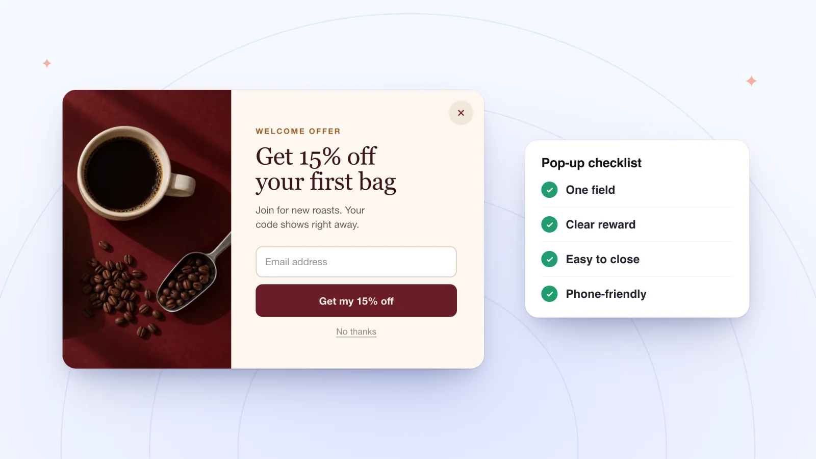
On this page
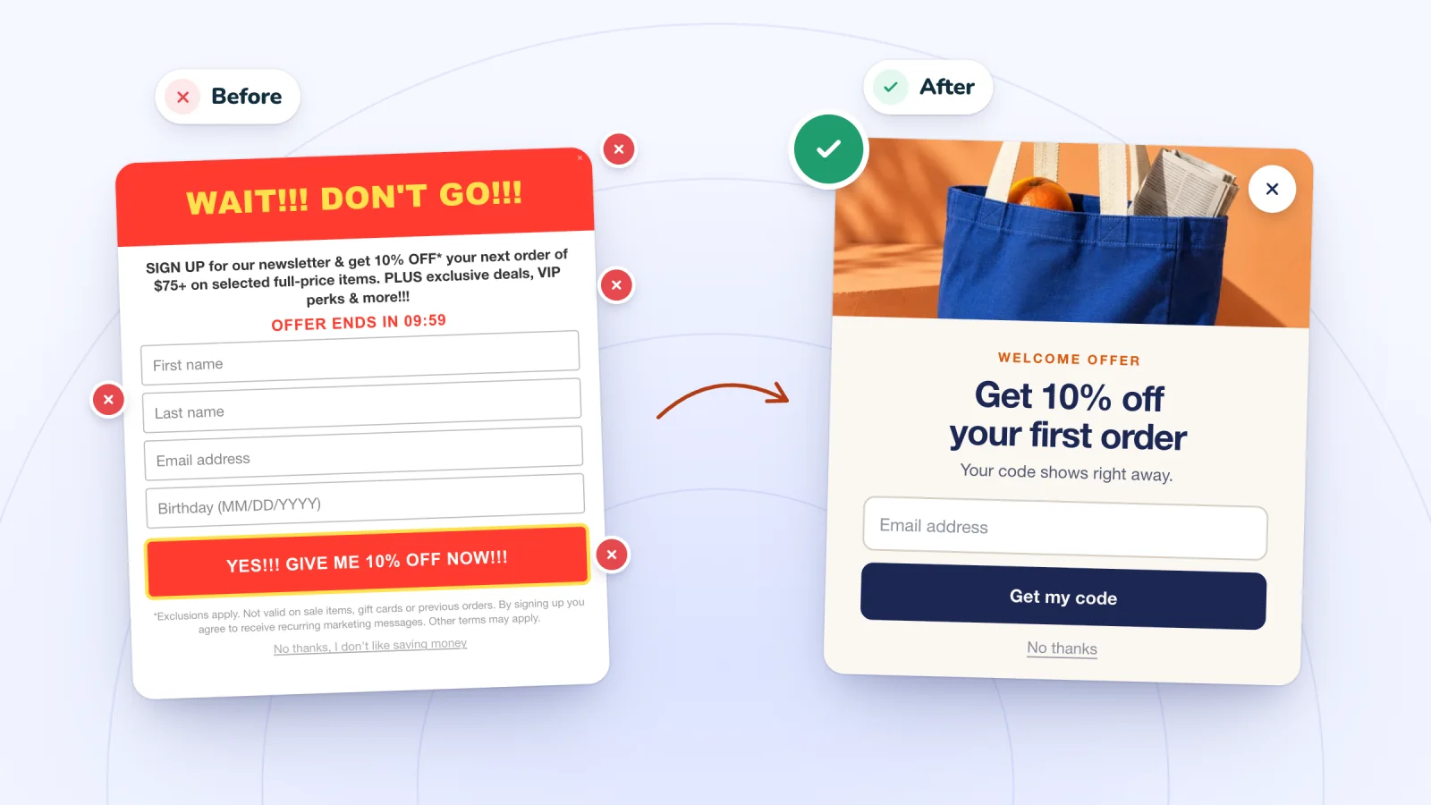
An email pop-up asks a stranger for something before they've bought anything. Done well, it feels like a fair trade. These practices cover the choices that matter most for a small store, from when the pop-up appears to how you test it.
Key takeaways
- Match the trigger to the page: a short delay on product pages, a scroll on blog posts, page views on home and collection pages.
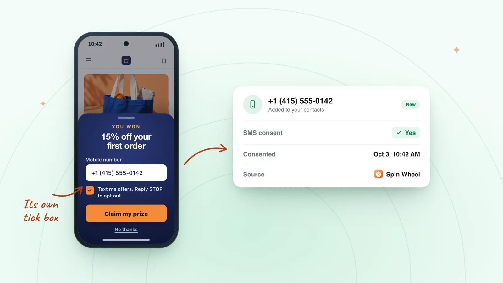
- Ask only for an email unless your first message will use a name, and treat email and texts as separate permissions.
- Write a headline that states the offer and a button that names what shoppers will receive.
- Test one change at a time for a full week, comparing sign-ups per visitor rather than raw counts.
Match the trigger to the page
There is no single best moment to show a pop-up. The right moment depends on what the visitor came to do.
- Product pages. Give people a few seconds with the product first. A short delay lets the offer arrive after they've seen what you sell.
- Blog posts and guides. Readers are busy reading. Showing the pop-up once they've scrolled partway down catches them after the post has proved useful.
- Home and collection pages. Visitors here are browsing. Waiting until they've viewed a few pages means the offer reaches people who are clearly interested.
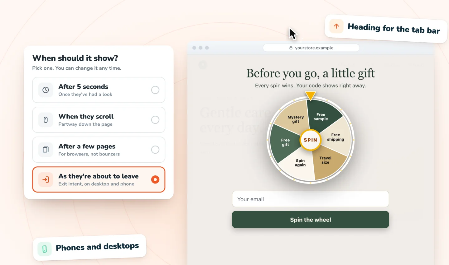
- A fallback for everyone else. An exit-intent trigger gives a gentle second chance to visitors who never saw the main pop-up.
If you can only set one trigger for the whole site, choose the one that suits the pages where your visitors usually land. Your store's analytics will show which pages those are.
Decide between one field and two
Each field you add is one more thing to type, and on a phone, one more trip to the keyboard.
- Email only. The quickest form. Use it when your welcome email doesn't need anything else.
- Email and first name. Adds a personal touch to later emails, at the cost of a second field. Add it only if your first email will actually use the name.
- Email and phone. These are two separate permissions, and texts come with their own rules. The guide to collecting SMS sign-ups with consent explains how to ask for both.
If you do add a name field, label it clearly as optional. People can then skip it without wondering whether the form will complain.
Write copy that earns the sign-up
A pop-up has room for very few words, so each piece gets one job.
- The headline states the offer. Say what they get in plain words. "Get $5 off your first order" is clearer than "Join our community."
- One supporting line sets expectations. Tell people what your emails contain and roughly how often they arrive.
- The button names what they'll receive. "Send my $5 code" tells the shopper exactly what happens when they tap.
- A small decline link lets them pass. "No thanks" is all it needs to say.
Say you sell loose-leaf tea. Put together, the pieces might read like this:
- Headline: "Get $5 off your first tea order"
- Supporting line: "New blends and brewing tips, about twice a month"
- Button: "Send my $5 code"
- Decline link: "No thanks"
Lay it out for thumbs and keyboards
On a phone, the keyboard takes over a big part of the screen the moment someone taps the field. Plan for it.
- Use the right field type. An email field set up with
type="email"brings up a keyboard with the @ sign, andautocomplete="email"lets the phone fill in a saved address. - Keep the field text at 16 pixels or larger. On some phones, smaller text makes the browser zoom in when the field is tapped, which throws the layout off.
- Keep the button close to the field. Placed right under the field, it stays in view above the keyboard.
- Trim words for small screens. If the headline wraps onto three lines on a phone, shorten it until it fits on two.
Pop-ups that show up at the right moment
Delay, scroll, page-count and exit-intent triggers on desktop and phone. A closed pop-up waits as a small tab.
Add to Wix, it's free
Make typing mistakes easy to fix
People mistype email addresses, especially on a phone. A good form catches the slip before it costs you a subscriber.
- Check the address when the button is tapped. If something is wrong, explain it in plain words right beside the field, such as "This address is missing an @."
- Catch obvious domain typos. A misspelled domain at the end of an address is a common slip. Offering a one-tap correction saves an address that would otherwise bounce.
- Keep what they typed. Clearing the field after an error makes the shopper start over, and some won't bother.
Add a short consent line
Under the field, a sentence or two should tell people what they're agreeing to. A clear line covers three things:
- What they'll receive, such as marketing emails from your store
- That they can unsubscribe at any time
- Where to find your privacy policy, with a link
A simple version might say, "By signing up, you agree to receive marketing emails from [Store name]. Unsubscribe anytime. Privacy policy."
Set rules for how often it appears
- After a close, give it a rest. Someone who closed the pop-up today doesn't need to see it again tomorrow. Waiting a week or two before showing it again keeps the offer from feeling like nagging.
- After a sign-up, stop showing it. A new subscriber who sees the same offer again may wonder whether their code worked.
- Hide it from people you already know. Visitors who click through from your own emails are already subscribed. If your pop-up tool can recognize them, for example by the tags on your email links, skip the pop-up for them.
Test one change at a time
Testing shows what works for your own store and your own visitors. Keep it simple:
- Change one thing. The headline, the offer, the trigger or the number of fields. Changing two at once makes the result impossible to read.
- Run each version for at least a full week. Weekday and weekend visitors can behave differently, so a full week gives both a fair say.
- Compare sign-ups per visitor. Divide sign-ups by the number of visitors who saw the pop-up. Raw sign-up counts rise and fall with traffic.
- Keep a log. Note the date, the change and the result. Months later, it's the only reliable way to remember what you tried.
To draft a pop-up and check it against points like these, try the free sign-up pop-up checklist. For worked examples and the numbers behind them, read this research on pop-up makeovers. And if your pop-up is already live and something feels off, the guide to pop-up mistakes and their fixes is a good next read.
If you sell on Shopify, myuser.ai lays out simple, spin and scratch pop-up forms for Shopify stores and connects each sign-up to AI welcome messages.
Frequently asked questions
Should an email pop-up offer a discount?
Not necessarily. A discount gives people a clear reason to sign up, but it costs you on every order that uses it, including orders that would have happened anyway. Free shipping, a gift with a first order, early access to new releases or useful tips can also give people a reason to join. Whatever you offer, state it plainly in the headline.
Should you use double opt-in for email sign-ups?
It's worth considering. Double opt-in asks each new subscriber to confirm by tapping a link in an email before they join your list. It keeps typos and fake addresses out and leaves a clear record that the person agreed. The trade-off is that some people never confirm. Expectations vary by country, and this is general information, not legal advice.
What's the difference between a pop-up and an embedded sign-up form?
A pop-up appears over the page at a moment you choose, such as after a delay or when a visitor seems ready to leave. An embedded form sits inside the page, often in the footer or on a blog post, and waits for people to find it. A pop-up is harder to miss, while an embedded form never interrupts anyone. You can use both, and the guide to growing your email list on Wix covers every other place to ask.
Where do pop-up sign-ups go?
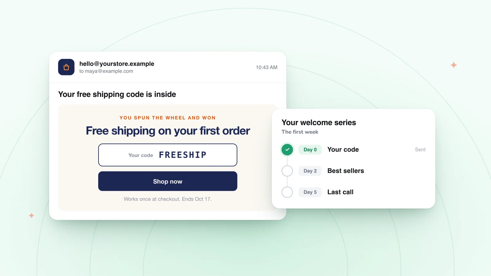
That depends on the pop-up tool. Ideally, each sign-up lands in your contact list or email tool automatically, along with the consent the shopper gave, so your welcome email can go out right away. Spin Wheel saves every sign-up to your site's contacts with the consent given. It doesn't send marketing emails itself, so you follow up with the email tool you already use.
Try it on your store
Spin Wheel includes a classic email sign-up pop-up alongside its games, and it can collect email, a phone number for texts, or both. See the options on the email pop-up page.

We build marketing apps for online stores: myuser.ai writes and sends emails and texts from a store's own products, and we make Spin Wheel and Session Recordings for Wix sites. Product details in our guides are checked against the apps themselves.